KaufDA styleguide refresh
In 2026, I refreshed kaufDA’s visual language for its blog and social media channels, with a focus on creating a more distinctive and flexible system for everyday editorial content.
I reworked and streamlined the color palette into a condensed set of colors, making it easier for the editorial team to create consistent content while leaving room for variation and experimentation.
The new direction combines AI-generated imagery, bold typography, and playful graphic elements to create a more expressive digital presence. The visual system was designed to work across a high volume of daily posts, keeping the brand recognizable while making each piece of content feel fresh, dynamic,
and attention-grabbing.
and attention-grabbing.
The result is a more playful and contemporary toolkit that gives the editorial team greater creative freedom, without compromising consistency across the brand’s digital ecosystem.
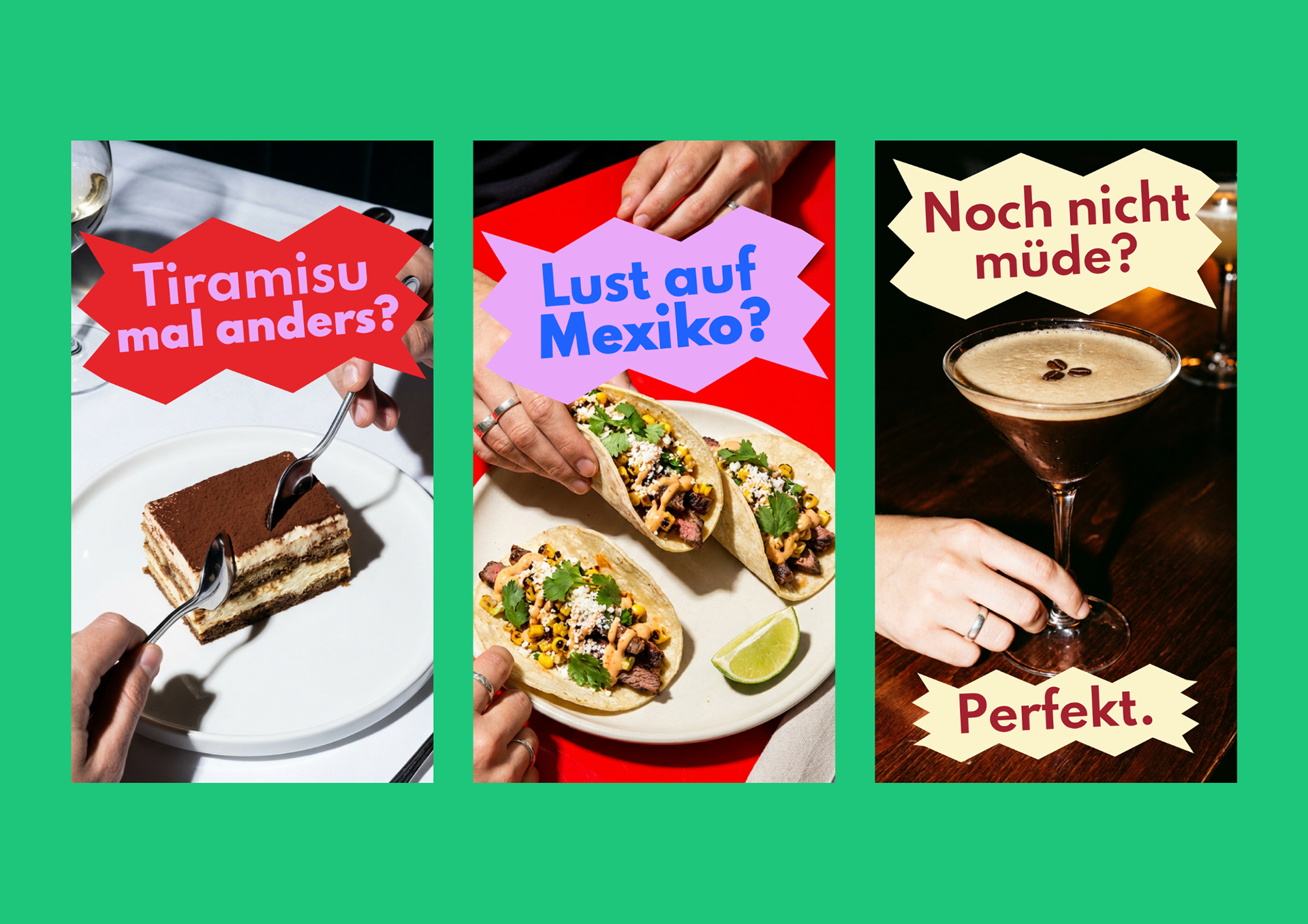
Adaptation of the initial design concept into a more serious and editorial visual language for daily articles, while maintaining the core graphic identity.
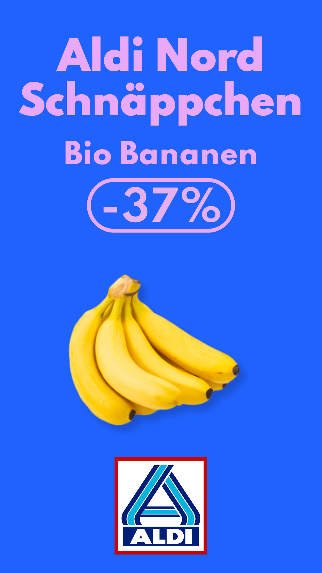
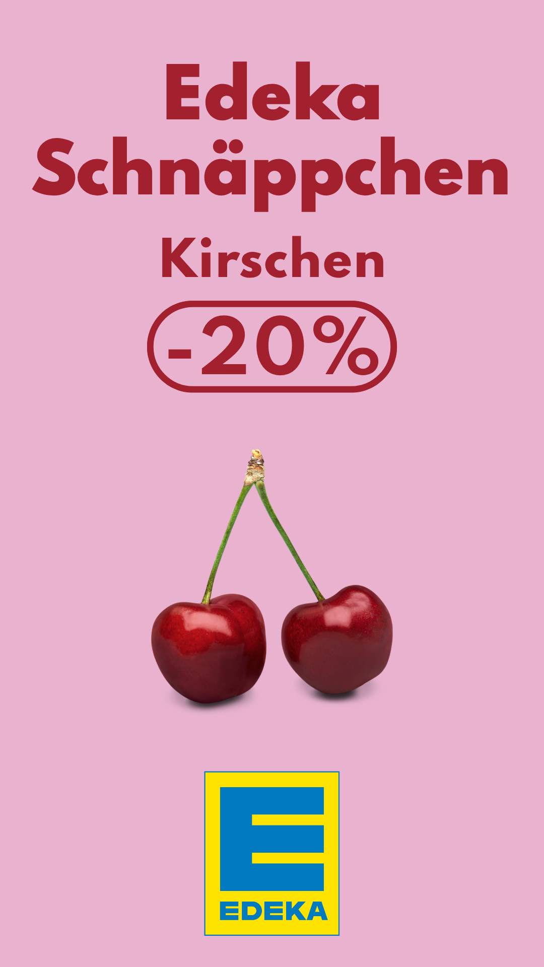
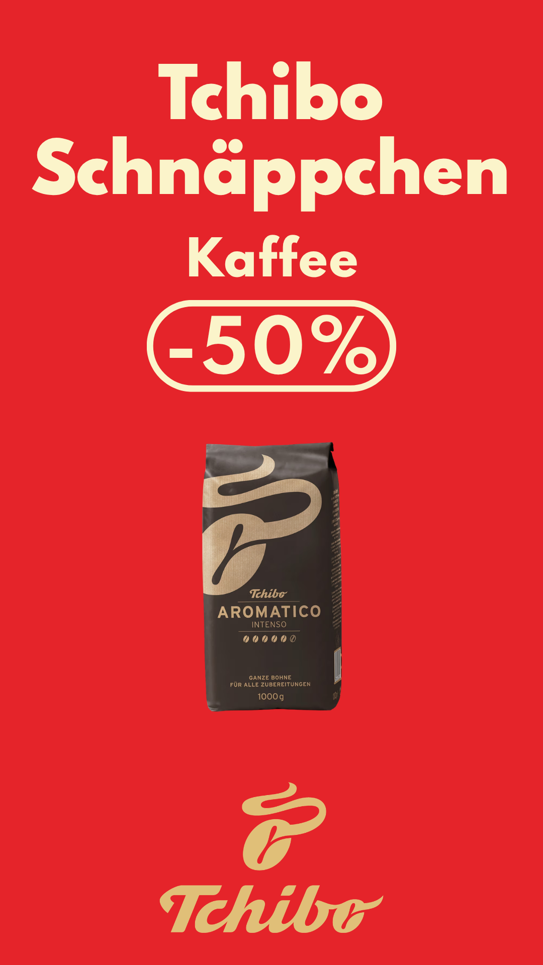
Introducing playful graphic shapes to add personality and visual impact,
and still maintaining the core graphic identity.
and still maintaining the core graphic identity.
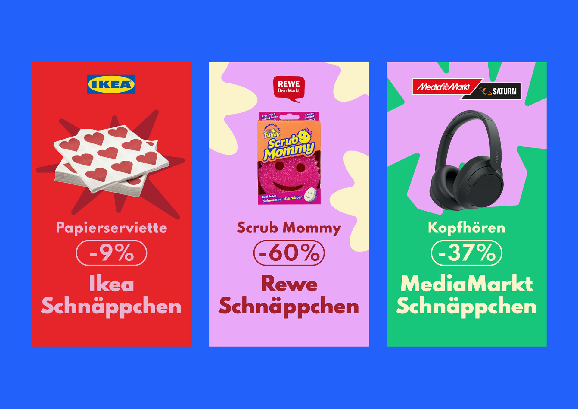
Daily posts created by the editorial team, showcasing the flexibility and versatility
of the new visual system.
of the new visual system.
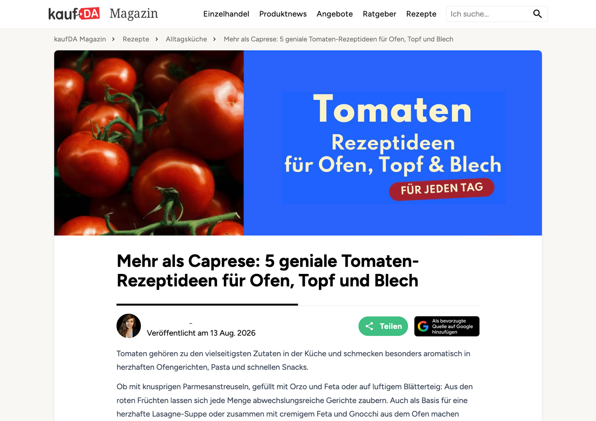
Development of a custom AI prompt to generate editorial imagery aligned with kaufDA’s visual identity, giving the editorial team the freedom to create relevant visuals for their articles
without relying on generic stock imagery.
without relying on generic stock imagery.